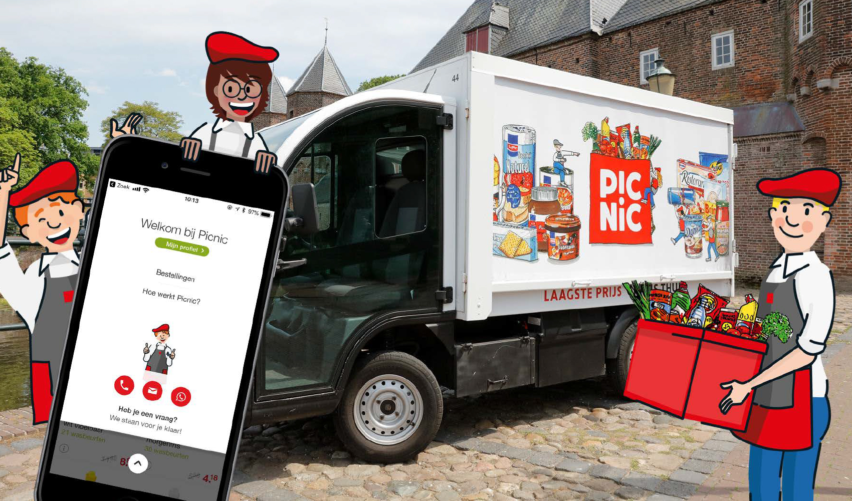


Picnic is an app-only supermarket that provides first-class delivery. The brand is inspired by the historic milkmen, who delivered fresh milk everyday to your doorstep, knew your entire family and shared the neighborhood gossip. Picnic revitalises this familiar and friendly delivery service. While the vision of Picnic stems from this old practice, the way the company functions is very modern and up-to-date.
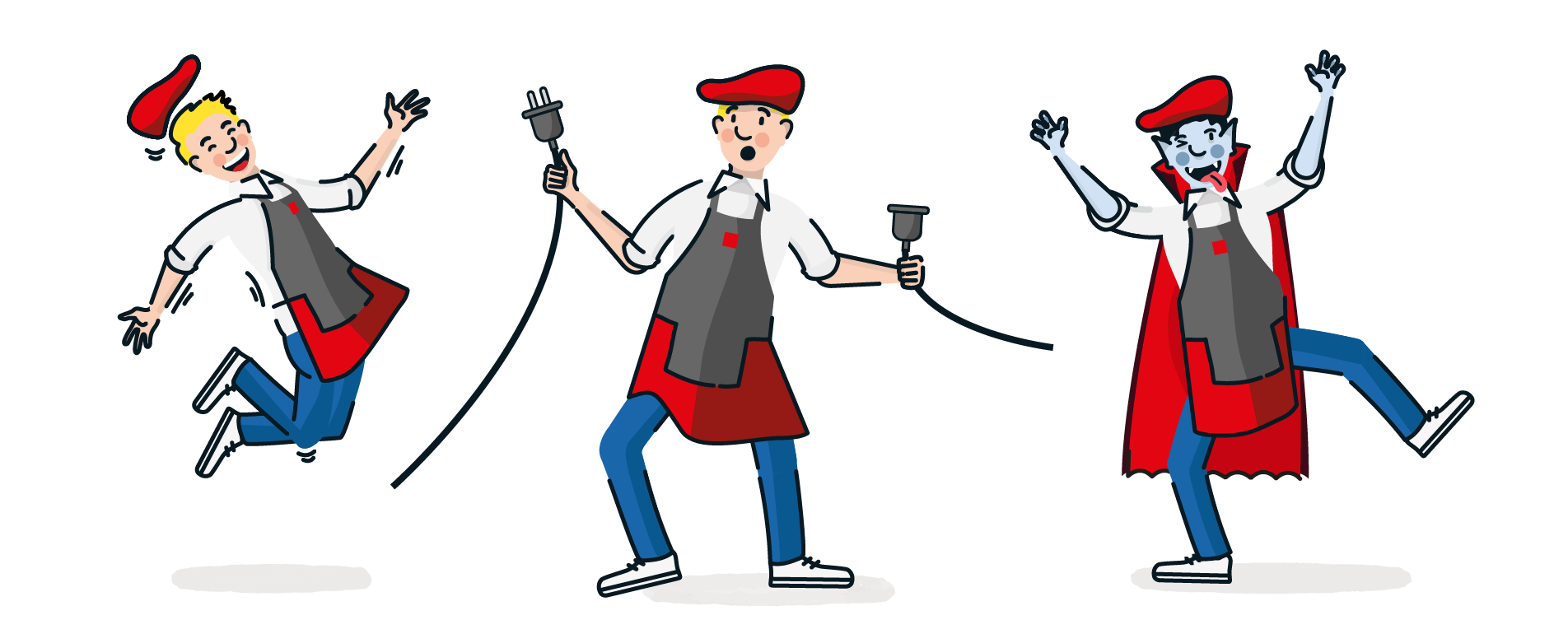
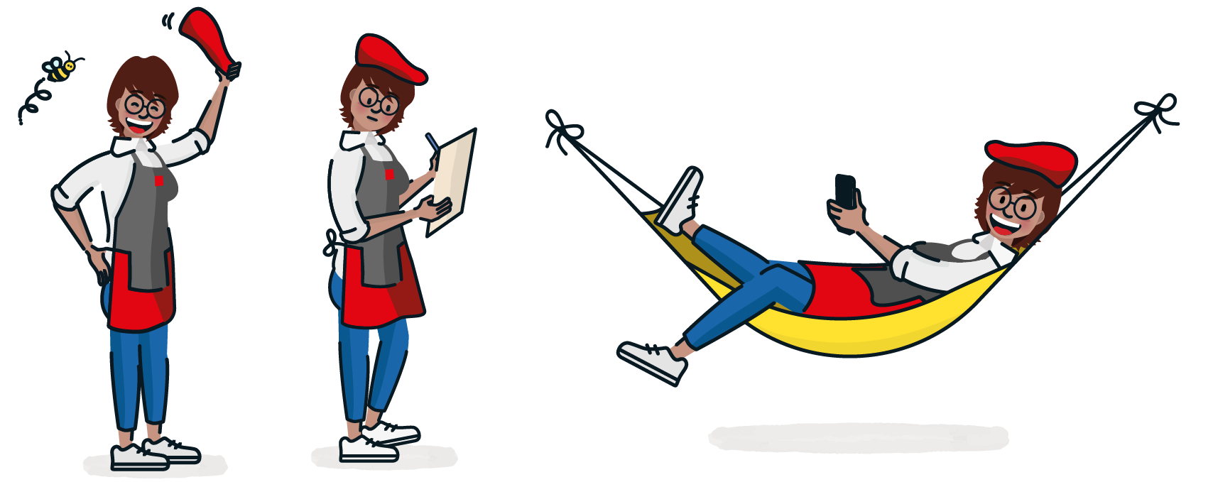
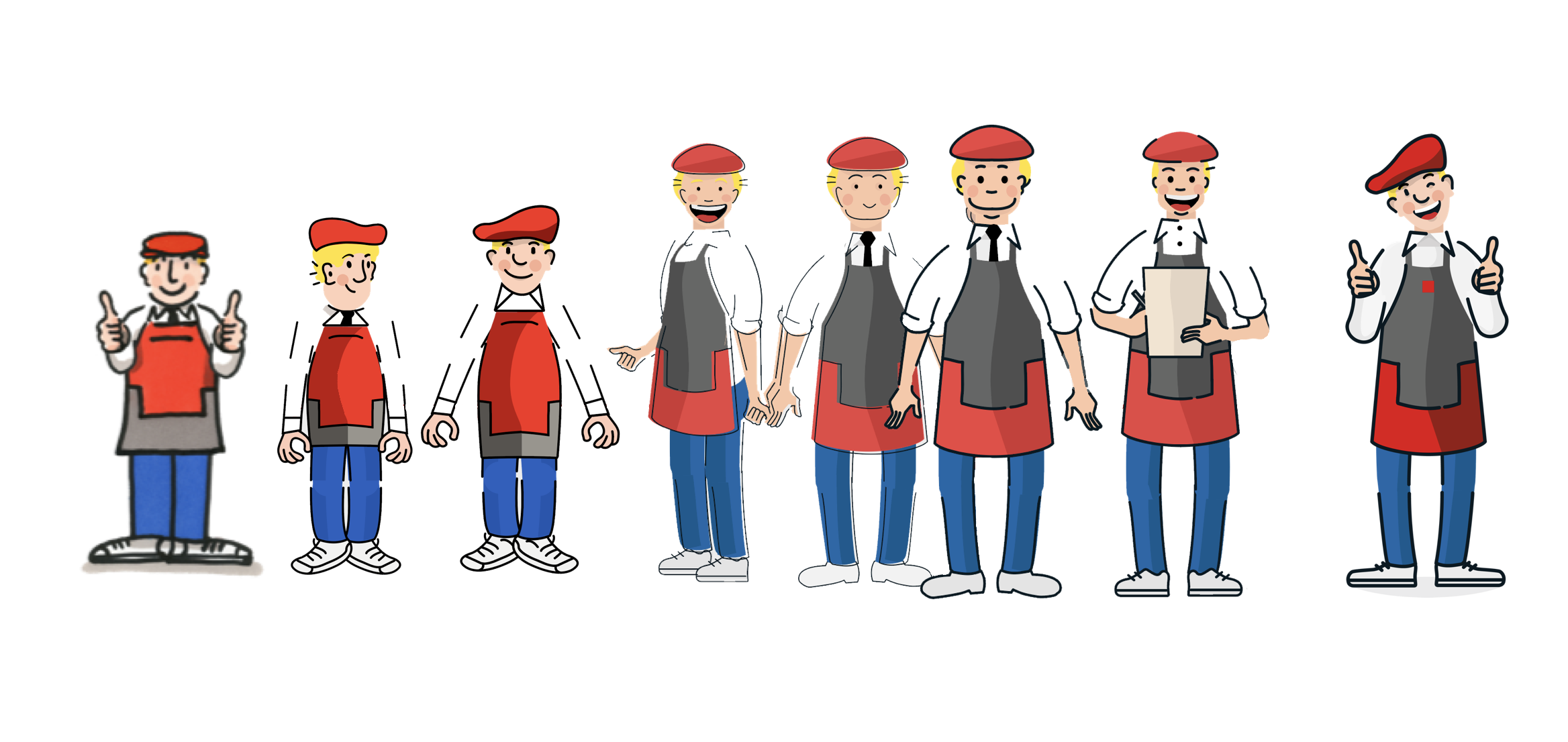
Inspired from the “milkman”, the initial Picnic branding was made to be ‘local and friendly’. Hand-drawn illustrations of a little man called Peter who wears an apron and a French beret. Peter soon became the brand mascot, and he embodies the spirit of the humble milkman.
Currently, digital companies are moving from selling a product to selling an experience. For a better experience, a product needs to be more interactive. Since, the original brand illustrations were all hand-drawn, they were static (not easily animatable) and hence there were limitations to how interactive Picnic could make the brand.
In co-creation with Picnic a more scalable world was created. The “Milkman” Peter got 2 new friends, Paula and Pelle. These Atomic based illustrations can be found throughout the app and on the EPV’s.

